New York
State Parks
We were thrilled to be asked by the Office of New York State Parks, Recreation and Historic Preservation to help them redefine their visual brand and develop a series of stylized and branded posters for a number of parks across the Empire State. We grew up going to many of these parks, so we gratefully accepted the challenge and reached out to a talented local illustrator and Ithaca-based type designer to assist us in making something special. Below is some of our work for the first eleven parks, more to follow!
BRAND IDENTITY
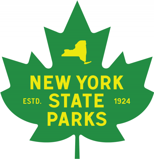
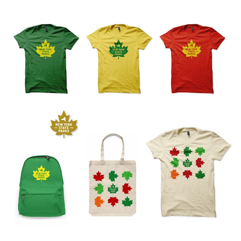
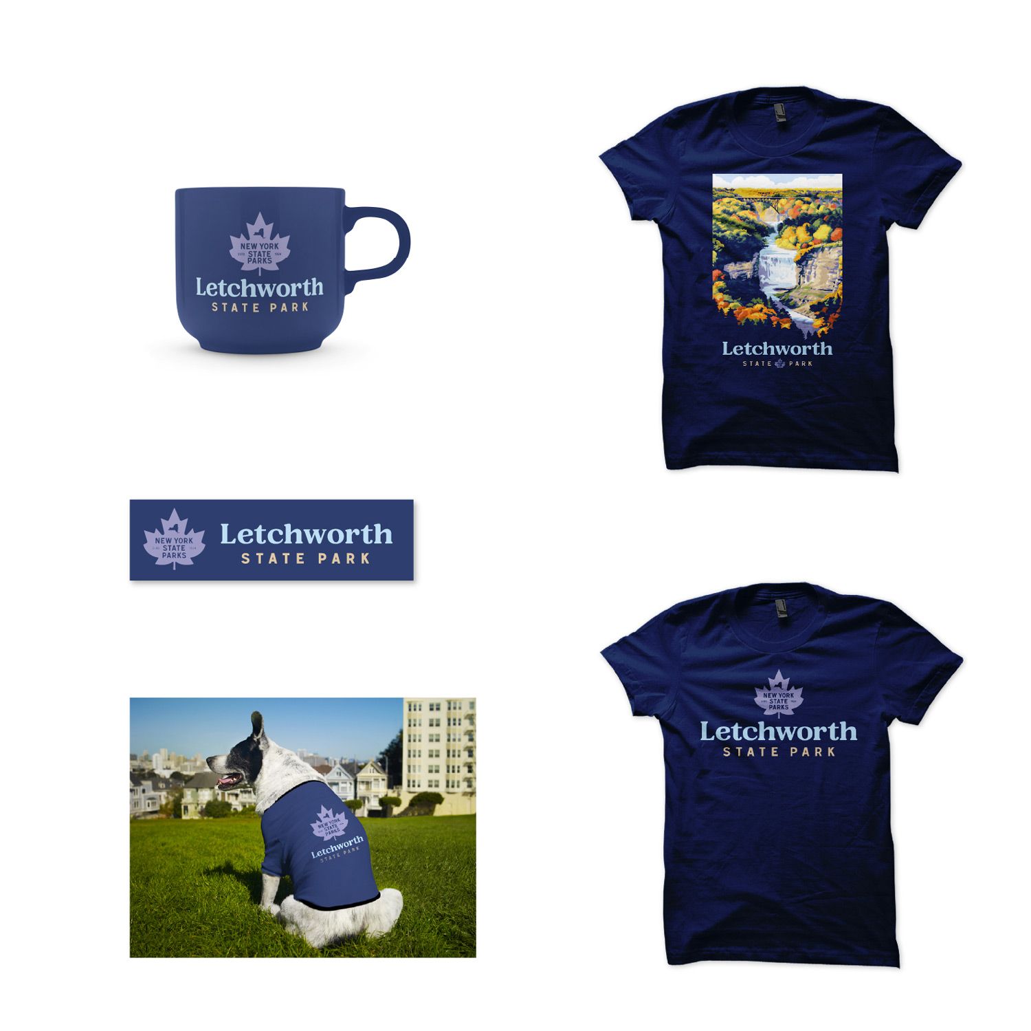
We designed a vibrant mark for NYS Parks to replace their difficult-to-use and dated previous lock-up. The objective was to create a new visual look crafted from known elements that could have been in use since the organization was founded in 1924. The new mark needed to be visually strong enough on its own for various merchandising opportunities.
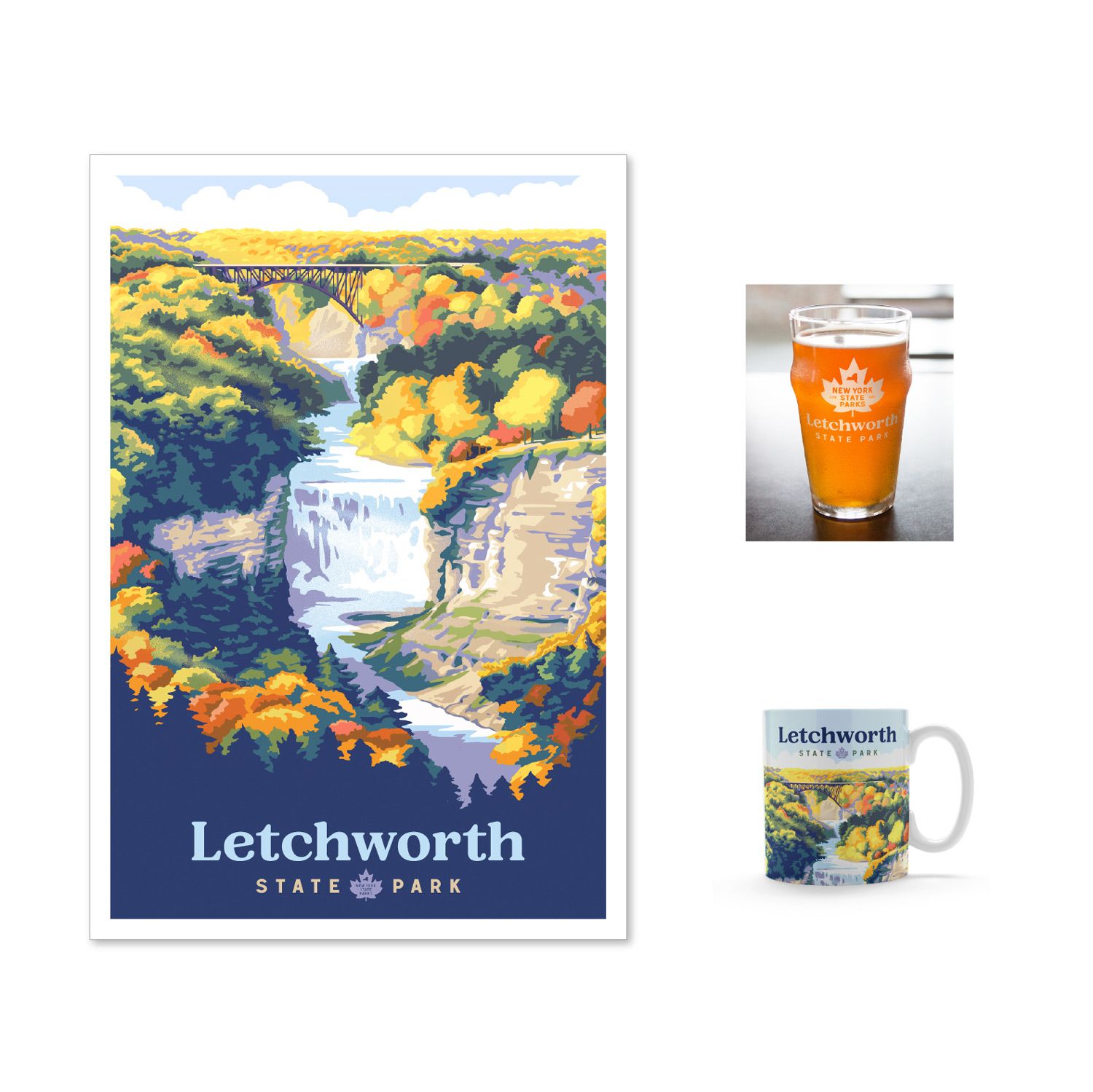
PARK POSTERS
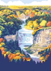
Benjamin Karis, illustrator:
My family and I are frequent visitors to many New York State Parks, so to work with the team to promote and celebrate these parks has been a real privilege.
Heading into the project, there was an effort to offer both continuity and variety across the series. We also strove to use a reduced color palette of bright colors, while offering enough detail to resolve features unique to each park. Additionally, we decided to transition the lower portion of each illustration to a single color to accommodate the park's name set in the new typeface.
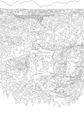
Working this way was an exciting challenge, and offered an excuse to visit many of these beautiful places in-person to explore possibilities. After some information gathering, my approach was to keep the drawings pretty loose in the beginning—experimenting with compositions in Adobe Photoshop by painting in a gestural way. As I reworked the image, I progressively tightened up the drawing and reduced colors to a specific palette. This was both a nod to the travel poster genre, and also a technical consideration, allowing us to convert the final image to a vector format (permitting the image to be scaled easily for different uses, see top left). Once that was complete, I shared the drawing with the rest of the team. It was always really satisfying to see the colorful typography and the new Parks logo applied to the illustrations in the final stage.
More at: benkaris.net
We also strove to use a reduced color palette of bright colors, while offering enough detail to resolve features unique to each park.
-- Benjamin Karis
A NEW TYPEFACE
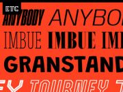
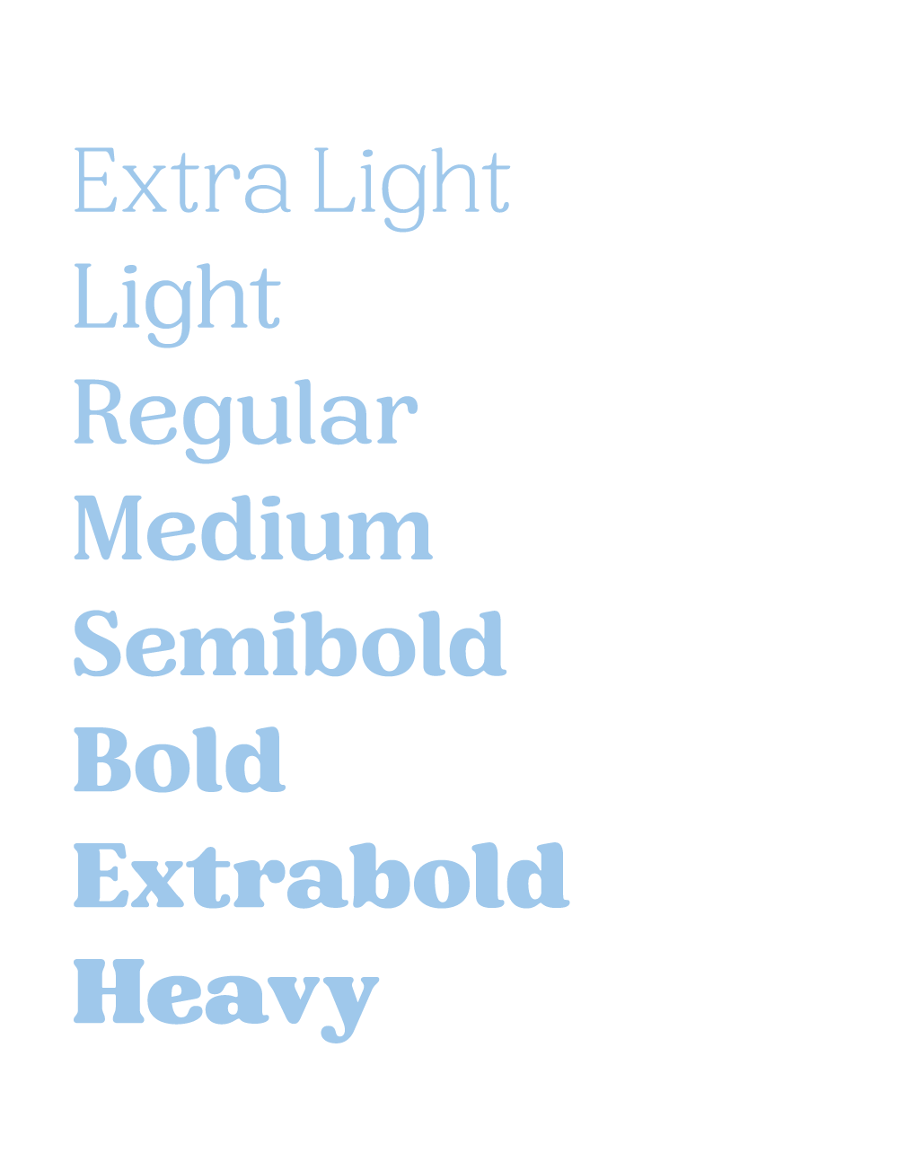
We wanted to create a distinctive attitude for all the elements in this project, and we knew original typography would play a major role in that effort. We worked with type designer Tyler Finck, from Etcetera Type Co. in Ithaca, NY, to craft a new variable face for NYS Parks. The new letterforms feature soft and approachable serifs and evoke a feeling of nostalgia, as many state parks do for those who visit.


NYSP BRAND MERCH

PARK-SPECIFIC MERCH
%20-%20Tint%20100.png?width=106&name=Logo%20-%20Standard%20-%20Blue%20(270%20x%20149)%20-%20Tint%20100.png)
